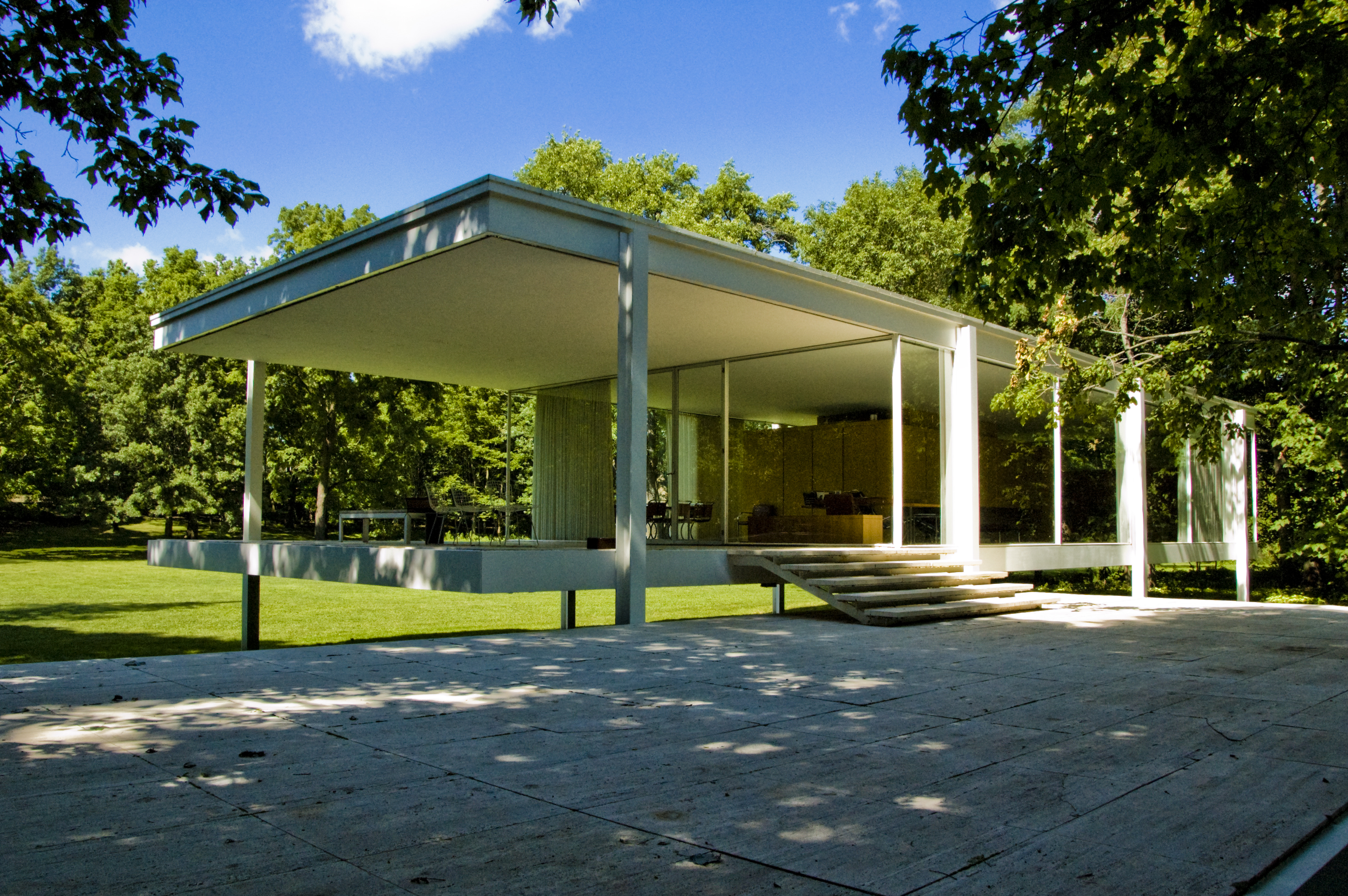
The structure is located to a very quiet, peaceful, relaxing and enjoyable ambient, where one can rest and appreciate the beautiful surrounding of nature. The construction that is coloured in white gives a clean and a higher definition to its connection with the association of greenness, it gives a glance of a simple, stylized and luxurious place, with large glass installed along with wide open spaces.
 |
| Mies van der Rohe, Farnsworth House 1951. |
Another significant building that was first constructed for
the Barcelona's International Exposition in the 1929, was of Ludwig Mies van der Rohe. which was unique and extraordinary at the time, since it was the
beginning of the new architectural movement. It is where he displayed strong lines, form and design in this beautiful construction, built from glass, steel and
different kind of marbles that expresses luxury and richness in its material. As one can notice the chosen colours are also based on earthy pigment, that until today that vogue is still being used, verifying from all these junk mail magazines, TV advertisements, bill boards and web pages adverts that we see of furniture, products, interiors and fashion.
| Mies van der Rohe, Barcelona Pavilion 1929 |
An example of modern to contemporary to classical home furniture design, found in one of the junk mail magazines, using natural and earthy blended colours. Thinking and relating the quotation that Mies van der Rohe used to paraphrase, is that ''less is more'' in use of the minimalism in characterising simplified, massive forms.
Looking at the picture below, I can tell how the dining pendent lighting is made with such a simple shape and form, including the chairs, the TV unit handles and the rest of its light coloured cabinetry furniture, leaving the natural wood vein showing, observing the book shelve that is placed at the top of the TV, it has a geometric, squarish and straight lined shape.
Studying the rest of the room I can also spot that as wall decorations, it has become a trend using typographic font frames as well with wall stickers, which some you find that are designed using different fonts and type, like the Sans Serif and Serif fonts that has come from an old century style (look at the picture on the right).
| Home furniture magazine, spring-summer 2016 |
The only furniture objects found within that building is the
famed Barcelona chair, that the German government has requested to Mies van der
Rohe to add in the building as a showcase for the world affair. The intrigue of van der Rohe was to place just two chairs and that they will be intended there
as thrones for the King and the Queen of Spain. The materials used were leather combined with modern chrome frames.
 |
Ludwig Mies van der Rohe and Lilly Rache, Barcelona chair 1929 |
Mies van der Rohe was one of the first creators that started
establishing modern architecture in the twentieth century, along with other
important master pioneers that are; Le Corbusier, Frank Lloyd Wright and Walter
Gropius. Together they started this new era of a modern style that states
simplicity, clean lines, smooth and a sleek trend.
I relate my work that I have manipulated using the 3Ds Max software, to the Barcelona chair of Mies Van Der Rohe and Lilly Rache. Through my findings of the off white leather material at the beginning was a bit hard only until I found the right match. I did my best to find the right reflection gloss and colour of the stainless steel.
I relate my work that I have manipulated using the 3Ds Max software, to the Barcelona chair of Mies Van Der Rohe and Lilly Rache. Through my findings of the off white leather material at the beginning was a bit hard only until I found the right match. I did my best to find the right reflection gloss and colour of the stainless steel.
References:
Barcelona Tourist Guide, 2016. 'Barcelona Pavilion: A Guide to Barcelona's Mies Van Der Rohe Pavilion'. [online] Available at: <http://www.barcelona-tourist-guide.com/en/attractions/barcelona-pavillion.html> [Accessed 22nd April 2016].
Fundacio Mies van der Rohe, 2015. Pavilion, documentation. [online] Available at: <http://miesbcn.com/the-pavilion/> [Accessed on 22nd April 2016]
Strizver, I., n.d. A typographic foundation: Serif vs. Sans Serif for text in print. fonts.com blog, [blog] Available at: <http://www.fonts.com/content/learning/fontology/level-1/type-anatomy/serif-vs-sans-for-text-in-print> [Accessed on 22nd April 2016]
Burns,M., 2016. What we mean when we say ''less is more'',[blog] Available at: <http://theothersideofcomplexity.com/what-we-mean-when-we-say-less-is-more/> [Accessed on 22nd April 2016]

